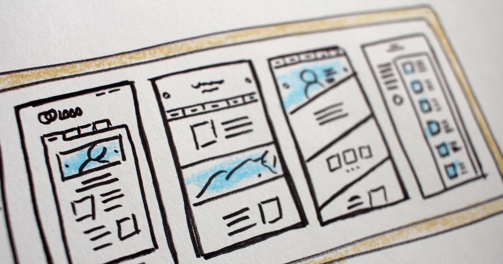
Photo by Hal Gatewood on Unsplash
Mastering Auto Layout: Creating Responsive and Adaptive UI Designs
Designing User Interfaces That Scale Seamlessly Across Devices and Orientations
WHAT IS AUTO LAYOUT ?
Auto Layout is a system for designing user interfaces in which elements are positioned and sized relative to one another and to the parent view, rather than being fixed to absolute positions and sizes.
It allows designers to create adaptive and flexible interfaces that can adjust their layout based on various factors, such as screen size, device orientation, and localization.
Auto Layout is based on a set of rules and constraints that define the relationships between the different elements in a user interface. Developers define constraints that describe how the elements should be positioned and sized relative to one another and to the parent view.
CONSTRAINTS IN AUTO LAYOUT
Constraints in Auto Layout define the desired relationships in terms of spacing, alignment, and sizing. For example, a constraint might specify that a button should be horizontally centered within its parent view, or that two labels should maintain a fixed distance from each other. These constraints create a system of equations that Auto Layout solves to determine the precise positions and sizes of the elements.
Auto Layout takes into account the intrinsic content size of elements, such as the natural size of text labels or images, and uses this information to dynamically adjust the layout. This means that if the text within a label grows or shrinks due to localization or dynamic content, the surrounding elements will automatically adjust to accommodate the changes.
One of the key benefits of Auto Layout is its ability to handle different screen sizes and orientations. With the increase of various devices, including iPhones and iPads with different screen sizes and aspect ratios, Auto Layout allows designers to create interfaces that adapt gracefully to different devices.
REASONS WHY AUTO LAYOUT IS THE KEY TO DESIGNING RESPONSIVE AND SCALABLE APPS.

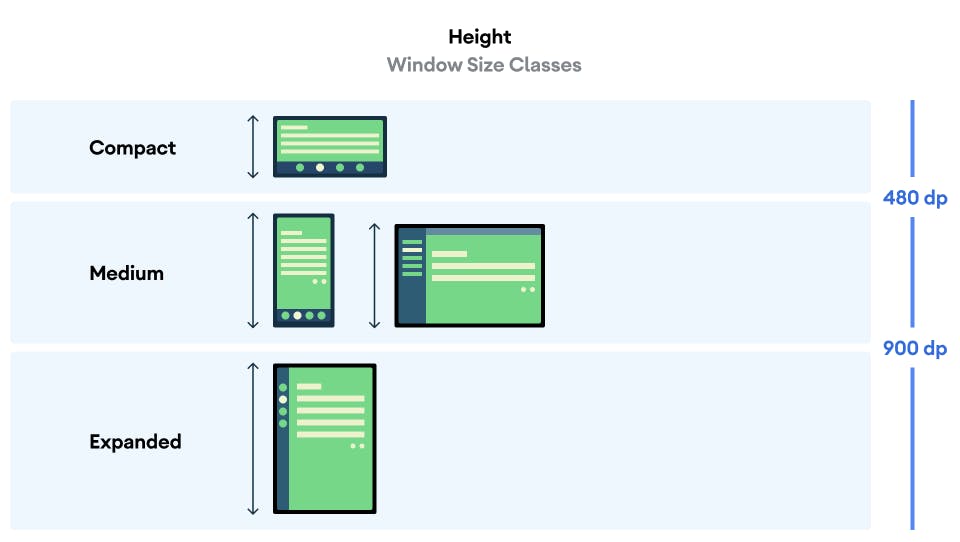
Img 1.0. The Image above shows the variety of screen sizes available.
- Dynamic screen size: refers to the ability of a user interface to adapt and adjust its layout based on the size of the screen it is being displayed on. With the wide variety of devices available today, such as smartphones, tablets, laptops, and desktop computers, each with different screen sizes and resolutions, it's crucial for user interfaces to be able to accommodate these variations.
Dynamic screen size adaptation involves designing interfaces that can scale, reposition, and resize their elements to fit different screen sizes while maintaining a visually appealing and functional layout. This adaptability ensures that the user interface remains accessible and usable across a range of devices and screen dimensions.
To achieve dynamic screen size adaptation, you can leverage techniques like responsive design and fluid layouts. Here are some key considerations and techniques for designing interfaces with dynamic screen size adaptation:
Responsive Design: Responsive design involves creating layouts that respond and adapt to changes in screen size. This approach often requires that you use fluid grids and flexible images to adjust the layout and styling based on the available screen space. It allows the interface to re-flow and rearranges elements as needed to provide an optimal viewing experience.
Fluid Layouts: A fluid layout is designed to expand or contract to fill the available space proportionally. Instead of using fixed pixel measurements for element sizes and positions, you can use percentages or relative units. This allows the elements to adjust their size based on the available screen width or height, ensuring a consistent and flexible layout.
Breakpoints: Breakpoints are specific screen widths at which the layout adapts to accommodate different devices. By defining breakpoints, designers can specify different layout behaviors for various screen sizes. For example, a multi-column layout on a large screen may switch to a single-column layout on a smaller screen.
Flexible Images and Media: Images and media elements should be designed to be flexible and adapt to different screen sizes. Techniques like CSS media queries and responsive image solutions allow images to be loaded at different resolutions based on the screen size and available bandwidth. This helps you to optimize the user experience by ensuring that images are appropriately sized and load quickly on different devices.
Testing and Iteration: It's essential for you to test the user interface on different devices, screen sizes, and orientations to ensure it adapts correctly. Continuous testing, feedback, and iteration are crucial to refining the design and ensuring a seamless experience across a variety of screen sizes.
By implementing these techniques, designers can create user interfaces that are responsive and adaptable to different screen sizes. Dynamic screen size adaptation is essential for providing users with a consistent and optimized experience, regardless of the device they are using to interact with the application.

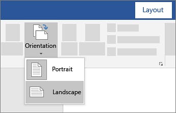
Img 2.0. The image above shows the different orientation changes of a device.
- Orientation changes: refer to the ability of a user interface to adapt and adjust its layout when a device is rotated between portrait and landscape orientations. As a designer, considering the scalability of a device in the design process is very crucial. Most modern devices, including smartphones and tablets, allow users to switch between these two orientations by simply rotating the device.
When it comes to designing interfaces that handle orientation changes effectively, there are a few key considerations and techniques you should keep in mind:
Aspect Ratio and Screen Dimensions: Portrait and landscape orientations have different aspect ratios and screen dimensions. In portrait mode, the screen is taller than it is wide, while in landscape mode, the screen is wider. As a designer, you need to consider these differences and ensure that the layout remains visually balanced and functional when switching between both orientations.
Fluid Layouts: Similar to dynamic screen size adaptation, fluid layouts are valuable for handling orientation changes. As a designer, you should make sure that the elements are designed to respond and adapt to changes in width and height when the orientation is switched. This can involve using relative units, like percentages, for sizes and positions, as well as utilizing flexible grids and containers to accommodate different aspect ratios.
Reordering and Repositioning: Some elements may need to be re-positioned or reordered when the orientation changes to maintain a logical and intuitive layout. For example, navigation bars, buttons, or menus might be better placed at the top or bottom of the screen in landscape mode, rather than on the sides as in portrait mode. Modifying the positioning of the elements can help you improve usability and optimize screen space.
Text and Content Adjustments: Text and content within the interface should adapt gracefully when users are switching between the two orientations. This includes adjusting line wrapping, font sizes, and image scaling to ensure readability and visual appeal. As a designer, you should consider how the reorientation affects the flow and presentation of text-heavy or media-rich content.
Testing and Iteration: As with dynamic screen size adaptation, testing the interface in both portrait and landscape orientations on various devices is crucial. This allows you to identify any layout issues, inconsistencies, or usability problems that may arise from the orientation change. Continuous testing and iteration ensure a seamless and enjoyable user experience in both orientations.
By addressing these considerations and implementing appropriate design techniques, users can create interfaces that smoothly transition and adapt to changes in device orientation.

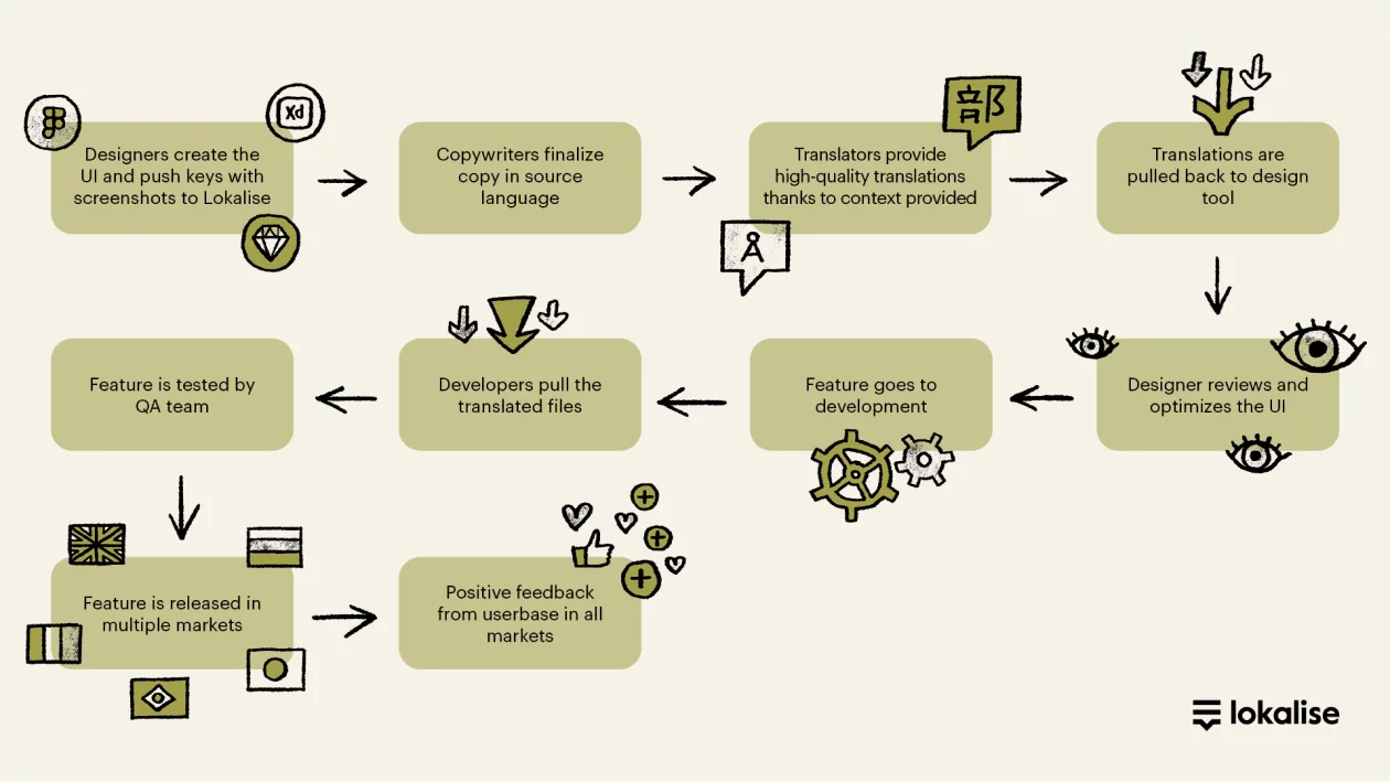
Img 3.0. The Image above shows the design stages for the localization process.
- Localization: refers to the process of modifying a software application or website to meet the language, cultural, and regional requirements of a specific target audience. As a designer, you need to translate and adapt the user interface, content, and other elements to make them suitable and relevant for users in different countries or regions.
Here are some key aspects and considerations you should take note of in the localization process:
Language Translation: The most important aspect you should take note of in the localization process is translating the user interface text, such as menu labels, buttons, error messages, and tooltips, into the target language. Professional translators or localization teams are typically engaged to ensure accurate and culturally appropriate translations. You should make sure the translated text should fit within the layout constraints and accommodate potential differences in text length between languages.
Cultural Adaptation: Localization in design goes beyond mere translation, it also involves modifying the user interface and content to align with the cultural norms, preferences, and sensitivities of the target audience. This means you should consider adjusting date and time formats, number and currency formats, measurement units, and localized images or icons that resonate with the local culture.
User Experience: The user experience should be seamless and intuitive for users of different languages and cultural backgrounds. In this process, you should be considering factors such as reading direction (left-to-right or right-to-left languages), layout adjustments to accommodate different text lengths, and ensuring that translated content does not impact the overall functionality or usability of the application.
Testing and Quality Assurance: Localization requires thorough testing to ensure the accuracy and functionality of the localized application. Linguistic testing involves validating translations for accuracy.
